
Stillman & Birn Gamma Series Multi-media Art Journal

Stillman & Birn produces multi-media art journals in five different series--the Alpha, Beta, Gamma, Delta & Epsilon series. Each comes in a plethora of sizes. Used for this review is an Gamma Series Heavy Weight Sketchbook Hardbound 5.5 x 8.5 inches (14 x 21.6 cm).
Look and Feel
As with all the Stillman & Birn sketchbooks, the cover is textured black binder board with the Stillman & Birn logo and the series name embossed on the lower back cover. You immediately get the impression of sturdiness, and if you look closely at the binding, you'll see it is both sewn and glued. There is an initial stiffness but if you slowly bend the sketchbook back as far as it will go, the binding loosens and the pages will lie flat. You'll need to do this in several places.

Although the paper is thick (though only about half as thick as the Beta and Delta series paper), it is very flexible. The wrapper states that it is 'suitable for all dry media and will accept light washes.' It has a smooth surface, but there is some grain to it.
The Gamma and the Alpha series books have the same paper, except for color. The Gamma comes in ivory. It's very light, and in some lights might seem white. Colors are slightly (slightly) less brilliant, but the ivory is slightly easier on the eyes.
Performance
Fabric tipped Art pens
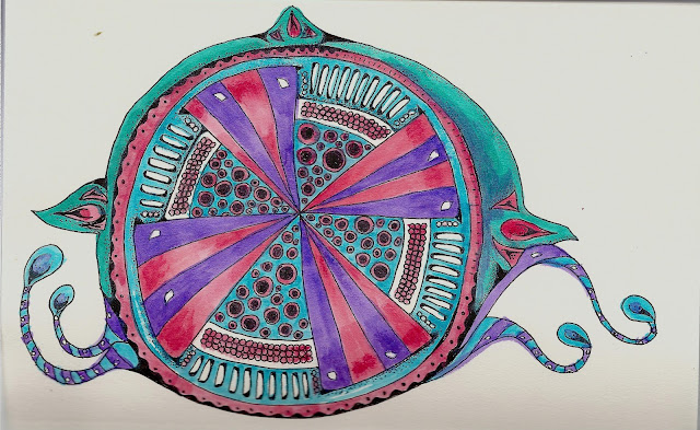
 I used Stabilo Point 88 fineliner pens for this drawing and the pattern steps. These pens use a water-based ink and are very good for drawing bold black lines. On totally smooth papers the line is very consistant which can be easy to use, and is desirable if you want stark black and white, but doesn't allow for building tonal values (gray to black; light to dark). On the Gamma's vellum, slightly-toothed surface the pens easily do both. Dark, stark blacks. Faint wispy grays. All the tones in-between. Vary the pressure and speed with which you draw and vary the tones you achieve.
NOTE about the tangle pattern: Bubble-up can be drawn as either symmetrical or asymmetrical. The lopsided 8 added in step 3 bulges out in left-right repetition. Make your 8s, both vertical and horizontal, similar in size and you'll have a clean, bold look. (Keep the bulge--just make every bulge the same size).
If you vary the size of your 8s, you get more of wild, meandering look.
Neither is better--you might want the very orderly look for a mandala, but choose the uneven look to imply the feel of pebbles or bunches of fruit. It's a choice.
Watercolor-Twinkling H2Os
 I did this a bit differently from my usual style. My preference is to add color first, then do my linework, and add more color if needed. This time I did my linework and painted in. I was surprised-the paper did curve quite a bit. There was no dimpling or buckling. I haven't weighted the book, yet, but I suspect the curve will straighten out when I do so.
Iris Folding/Stamp pad ink/Metallic marker
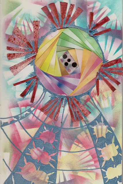
This didn't come out as good as I hoped, but it was a first try, and I learned a few things. For the purposes of this review, I learned that the Gamma paper is excellent for this kind of mixed media.
If you are unfamiliar with Iris Folding, the basic steps are:
Cut a hole in your paper (the journal page, in this case).
Tape folded strips of colored paper in a layered spiral pattern, on the back of the paper (this resembles the shutter and iris of a camera).
Tape something on the back to cover up the strips and tape.
Decorate the front of the page around the Iris.
I wanted to see how the pages of my Gamma sketchbook held up to cutting, and to the weight of the 'iris'. I also used the journal piece that was cut out--I cut it in quarters, made a fan of each quarter and used the fans as stencils, before spraying them with Tattered Angels glimmer mist.
Results--I put the corner of a cutting mat under the page, and used an exacto blade to cut out my circle. The paper cut easily. There are a couple of ragged edges. That was me. I was moving my blade rather than turning the page.
I used Origami paper for my strips. It isn't terribly heavy, but I added 28 strips and the weight does add up. The paper held up to the weight as though it wasn't there. No buckling or warping whatsoever. I taped a piece of cardstock over the back of the taped paper strips. The paper carried that extra weight easily. I didn't like how it looked, however, so I removed the cardstock and taped two pages together. You can barely tell the difference.
I rubbed a sponge over an inkpad, and holding the cut-out fans down, on the page, I dabbed the sponge around the fans to get a stencil effect. Even though the 'fans' were cut into fairly thin strips, the paper held up to some energetic dabbing.
I tore the fans apart because I wanted to use them for petals. Than I ruined things by adding metallic marker. I don't like it, and I'll probably add on some 'collage' items. There also aren't enough 'petals' but I didn't have anymore of the cut-out piece left. Since this review is about the Gamma paper, not Iris folding, I decided to quit for now.
Alcohol marker bleedthrumanade

I used Spectrum Noirs for the background color and Micron Pigma for the linework. The marker color goes on rich and deep, but isn't brilliant. The bleed through to the back of the page is 10-20% and I decided to try something different, which leads me to....
Color pencil-Lyra Rembrandts

I don't know what it is, but when I use any kind of pencil, my hands ache after a while. They seldom do when I use pen, so it must be the type of repetitive motion I'm using, or the amount of pressure. At any rate, it can take a while to build up your color and values with pencil and that causes me pain. I've been playing around using the pencils over alcohol marker--that way some of values are already established, and I don't have to work as hard at it.
There's a downside of course. It's harder to get the right tonal values where you want them, but that's the kind of challenge I love, lol!
As soon as I turned the page, I 'saw' this young lady in the color that bled through from the front of the page. She told me quite plainly that she needed the soft, subtle colors that you get with colored pencil, and Voila! Here she is!.
Conclusion:
The Gamma series sketchbook has a beautiful surface for pen & ink work, and the ivory paper is easy on the eyes while still providing bright color. It holds up to light washes, cuts easily without being easy to tear and is capable of supporting the weight of collage or ephemera. The binding is excellent, the book lies flat, even in hardbound format.
With this review, I've shown you all the current sketchbook series. I hope Stillman & Birn come out with more. I'd love to see toned paper or more surfaces. The Stillman & Birn sketchbook is priced competitively, affordable enough for the casual user. And the quality makes it suitable for any level of artist.
My previous Stillman & Birn reviews:
Comparison of the different Stillman & Bern Series sketchbooks
Alpha Series Review
Beta Series Review & Comparison of Hardbound vs Wirebound
Delta Series Review
Epsilon Series Review
Find out more at the Stillman &Birn website.

The Specs
Paper weight: 100 lb (150 gsm)
Paper color: Ivory
Surface: Vellum
62 sheets, 124 pages
Bound in the United States
Look and Feel
As with all the Stillman & Birn sketchbooks, the cover is textured black binder board with the Stillman & Birn logo and the series name embossed on the lower back cover. You immediately get the impression of sturdiness, and if you look closely at the binding, you'll see it is both sewn and glued. There is an initial stiffness but if you slowly bend the sketchbook back as far as it will go, the binding loosens and the pages will lie flat. You'll need to do this in several places.

Although the paper is thick (though only about half as thick as the Beta and Delta series paper), it is very flexible. The wrapper states that it is 'suitable for all dry media and will accept light washes.' It has a smooth surface, but there is some grain to it.
The Gamma and the Alpha series books have the same paper, except for color. The Gamma comes in ivory. It's very light, and in some lights might seem white. Colors are slightly (slightly) less brilliant, but the ivory is slightly easier on the eyes.
Performance
Fabric tipped Art pens

NOTE about the tangle pattern: Bubble-up can be drawn as either symmetrical or asymmetrical. The lopsided 8 added in step 3 bulges out in left-right repetition. Make your 8s, both vertical and horizontal, similar in size and you'll have a clean, bold look. (Keep the bulge--just make every bulge the same size).
If you vary the size of your 8s, you get more of wild, meandering look.
Neither is better--you might want the very orderly look for a mandala, but choose the uneven look to imply the feel of pebbles or bunches of fruit. It's a choice.
Watercolor-Twinkling H2Os

Iris Folding/Stamp pad ink/Metallic marker

This didn't come out as good as I hoped, but it was a first try, and I learned a few things. For the purposes of this review, I learned that the Gamma paper is excellent for this kind of mixed media.
If you are unfamiliar with Iris Folding, the basic steps are:
Cut a hole in your paper (the journal page, in this case).
Tape folded strips of colored paper in a layered spiral pattern, on the back of the paper (this resembles the shutter and iris of a camera).
Tape something on the back to cover up the strips and tape.
Decorate the front of the page around the Iris.
I wanted to see how the pages of my Gamma sketchbook held up to cutting, and to the weight of the 'iris'. I also used the journal piece that was cut out--I cut it in quarters, made a fan of each quarter and used the fans as stencils, before spraying them with Tattered Angels glimmer mist.
Results--I put the corner of a cutting mat under the page, and used an exacto blade to cut out my circle. The paper cut easily. There are a couple of ragged edges. That was me. I was moving my blade rather than turning the page.
I used Origami paper for my strips. It isn't terribly heavy, but I added 28 strips and the weight does add up. The paper held up to the weight as though it wasn't there. No buckling or warping whatsoever. I taped a piece of cardstock over the back of the taped paper strips. The paper carried that extra weight easily. I didn't like how it looked, however, so I removed the cardstock and taped two pages together. You can barely tell the difference.
I rubbed a sponge over an inkpad, and holding the cut-out fans down, on the page, I dabbed the sponge around the fans to get a stencil effect. Even though the 'fans' were cut into fairly thin strips, the paper held up to some energetic dabbing.
I tore the fans apart because I wanted to use them for petals. Than I ruined things by adding metallic marker. I don't like it, and I'll probably add on some 'collage' items. There also aren't enough 'petals' but I didn't have anymore of the cut-out piece left. Since this review is about the Gamma paper, not Iris folding, I decided to quit for now.
Alcohol marker bleedthrumanade

I used Spectrum Noirs for the background color and Micron Pigma for the linework. The marker color goes on rich and deep, but isn't brilliant. The bleed through to the back of the page is 10-20% and I decided to try something different, which leads me to....
Color pencil-Lyra Rembrandts

I don't know what it is, but when I use any kind of pencil, my hands ache after a while. They seldom do when I use pen, so it must be the type of repetitive motion I'm using, or the amount of pressure. At any rate, it can take a while to build up your color and values with pencil and that causes me pain. I've been playing around using the pencils over alcohol marker--that way some of values are already established, and I don't have to work as hard at it.
There's a downside of course. It's harder to get the right tonal values where you want them, but that's the kind of challenge I love, lol!
As soon as I turned the page, I 'saw' this young lady in the color that bled through from the front of the page. She told me quite plainly that she needed the soft, subtle colors that you get with colored pencil, and Voila! Here she is!.
Conclusion:
The Gamma series sketchbook has a beautiful surface for pen & ink work, and the ivory paper is easy on the eyes while still providing bright color. It holds up to light washes, cuts easily without being easy to tear and is capable of supporting the weight of collage or ephemera. The binding is excellent, the book lies flat, even in hardbound format.
With this review, I've shown you all the current sketchbook series. I hope Stillman & Birn come out with more. I'd love to see toned paper or more surfaces. The Stillman & Birn sketchbook is priced competitively, affordable enough for the casual user. And the quality makes it suitable for any level of artist.
My previous Stillman & Birn reviews:
Comparison of the different Stillman & Bern Series sketchbooks
Alpha Series Review
Beta Series Review & Comparison of Hardbound vs Wirebound
Delta Series Review
Epsilon Series Review
Find out more at the Stillman &Birn website.
Love your young lady - her eyes are just terrific.
ReplyDeletePaula (PEP)